The Power Law Just Got an Upgrade: Introducing the Time-Corrected TradingView Quantile Indicator

Bitcoin’s price looks chaotic in the short term.
But zoom out far enough and a surprisingly stable pattern emerges: Bitcoin has historically followed a power-law growth curve.
The pattern was first highlighted by Giovanni Santostasi in 2014 and has since been widely discussed across the Bitcoin research community.
The problem? Most public versions of the Bitcoin power-law chart contain subtle statistical flaws that distort the model.
Many investors have been disappointed by Bitcoin’s price action, wondering whether the power-law model has broken down. But as you’ll see, the power law didn’t break; the model was just anchored too early.
Our optimised Power Law Indicator, now available on TradingView, fixes several structural issues in traditional power-law models and lets anyone explore the results directly on live charts.
Add the indicator on TradingView now
The result is a dynamic valuation corridor that captures Bitcoin’s entire market cycle — from capitulation lows to euphoric peaks.
Once the early-data bias is corrected, the power law doesn’t disappear — it simply becomes more realistic.
Key Improvements Over Traditional Power-Law Models
Our time-corrected quantile power law model introduces several structural improvements:
• Optimised Day-0 aligned with market emergence, avoiding early noise
• Jacobian weighting to eliminate log-time bias
• Refined quantile valuation bands
• TradingView indicator for live analysis
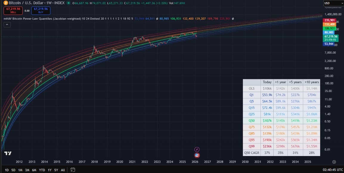
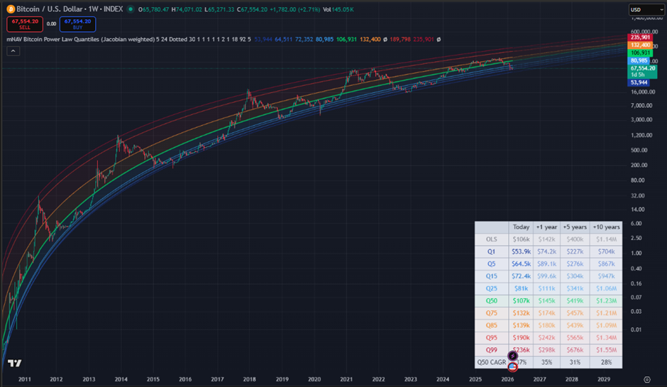
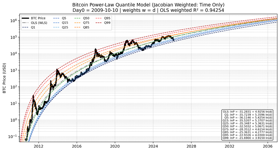
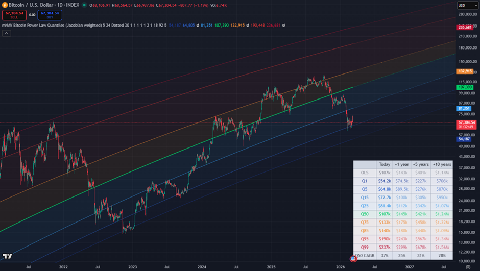
What the Indicator Shows
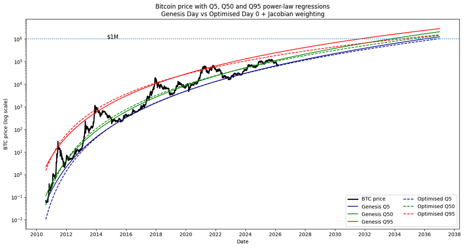
The indicator visualizes Bitcoin’s long-term valuation corridor using quantile regression bands, first applied to Bitcoin by Plan C in 2022.
Instead of a single trend line, the model maps a full valuation corridor showing where Bitcoin has historically traded relative to its long-term trajectory.
By plotting these bands directly on the TradingView chart, the indicator helps investors quickly understand where Bitcoin sits within its historical valuation range.
Why Traditional Power-Law Charts Break
Most models simplistically anchor time at Bitcoin’s Genesis Block (3 January 2009).
But price discovery and Bitcoin’s store-of-value function did not begin when the protocol launched — they really began when markets formed, and Bitcoin started trading.
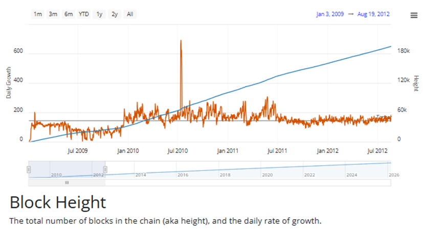
Not only is the early price data extremely volatile, but the rate of mining was erratic, and didn’t stabilise until more people started mining in late 2011.
Bitcoin ultimately derives value from proof-of-work security and network adoption, both of which influence market capitalisation. The relationship between block height and market cap is extremely tight. However, the changing issuance rate due to halvings also introduces another variable that is hard to correct for when we try to convert block height vs. market cap back to normal price vs time (which is what most people care about).
After testing several approaches, we found the most robust workaround was to treat the start date as a floating model parameter that could also be optimised.
What Makes This Model Different?
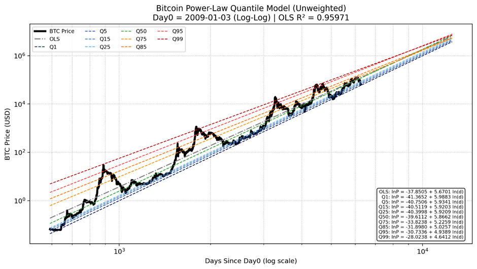
Our optimised power-law indicator uses a refined statistical framework to enhance the integrity of power-law regression.
Most power-law models are built entirely in log-log space. But this causes disproportionate weighting of the data during the early, volatile period, leading to large errors in current and future predictions.
Equal spacing in log-time corresponds to exponentially increasing calendar intervals, meaning that, as recently noted by Plan C, early observations receive disproportionate influence in the regression.
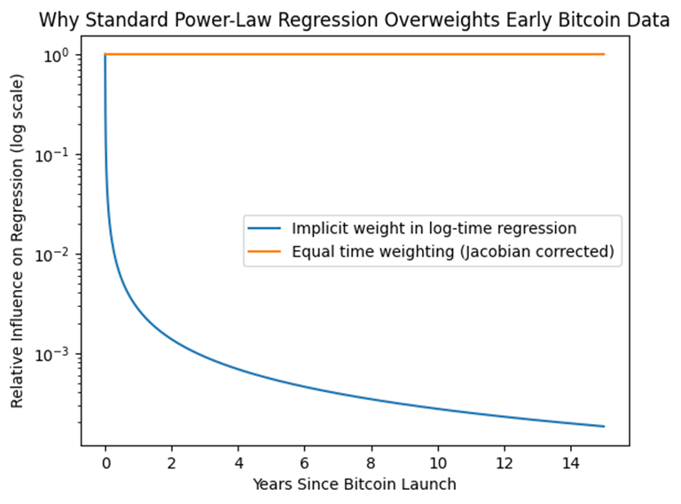
The refined model corrects this using Jacobian time-corrected weighting. In simple terms, each day of Bitcoin data receives an equal vote. Instead of creating a chart that looks great in log-log space, the refined model is more balanced, giving recent and early data equal weight.
Once early-data bias is removed and Day-0 shifts forward, the valuation corridor tightens over time, reflecting Bitcoin's compressing volatility.
How Much of a Difference Does this Make?
It’s been interesting to see how much attention the optimised power-law model has garnered over the past few days, with some leaders in the space wondering whether it’s really worth updating their models.
To help understand the significance of the optimisation, the chart below shows the years it will take each quantile line to cross $1m, with and without the optimisation.
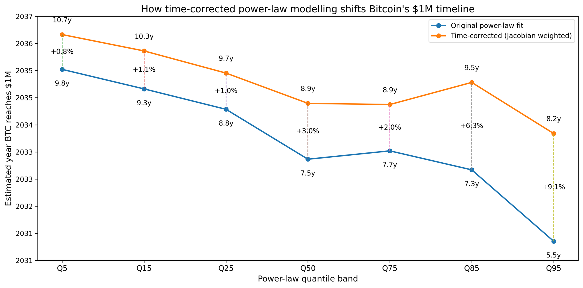
Optimising Day 0 and correcting for the log time bias pushes the $1m crossing back by:
- Q5 - 10 months (0.8%),
- Q50 - 17 months (3%), and
- Q95 - 33 months (9%).
Overall, pushing back Day 0 lowers the power-law floor a little but really compresses the upper quantiles in the future, while mapping the 2013 peaks a little better.
Where the differences become more interesting is when we compare the quantiles forecast made by each model today. Overall, you can see that the classic power law is consistently more bullish, particularly for the upper quantiles.

This difference may not be a big deal if you’re hodling for the next 20 years, but if you’re trying to buy the Q5 dip now, it makes a significant difference, and this knowledge would have prevented a lot of people from going all in at the top last year, believing we were heading for a four-year cycle peak at $300k.
How Investors Use the Indicator
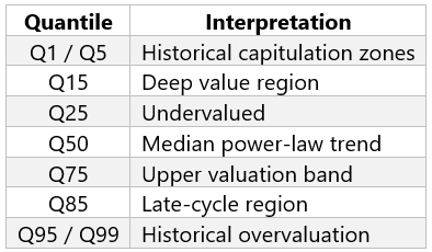
The power-law framework works best as a long-term valuation context, not a short-term trading signal. Investors often use the quantile bands to identify:
• potential accumulation zones near lower quantiles
• possible distribution zones near upper quantiles
• Bitcoin’s position within its macro adoption cycle.
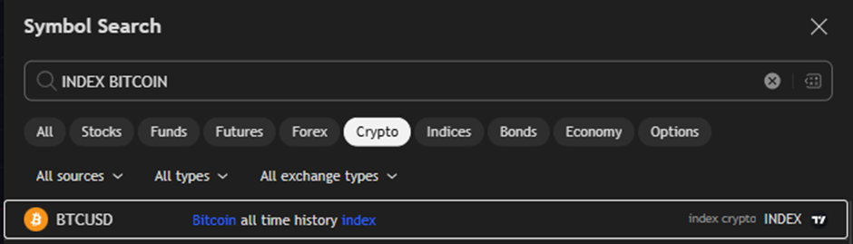
To see the maximum amount of data and the long-term trends, the indicator works best with the Bitcoin all-time history index in TradingView.
The model works best viewed on the log scale, but to engage hopium mode, right click on the prices on the RHS of the chart and change this to the regular price scale.
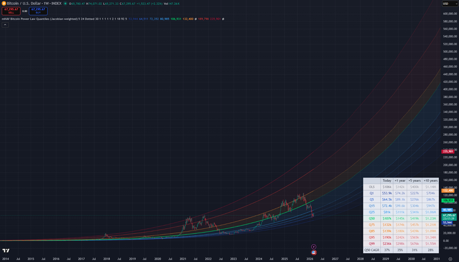
For more detail, click the indicator lines, right-click, and select settings. There, you can turn on more regression lines (e.g., Q15, Q85, and OLS, which aren’t shown in the default version).
Where Are We Now?
At the time of writing, after breaking through Q85 multiple times over the past year or so, we’re now sitting just above the Q5 line.
To the left of the chart, we see that this aligns with the top of the 2024 consolidation zone and the top of the November 2021 cycle before FTX blew up. Afterward, Bitcoin continued to chop between the Q5 and Q15 lines for 18 months, with a brief excursion below the Q1 line.
Where Are We Going?
No model can predict short-term price movements.
But if Bitcoin continues along its long-term adoption trajectory, the quantile bands highlight periods where the asset has historically traded at deep discounts or extreme premiums.
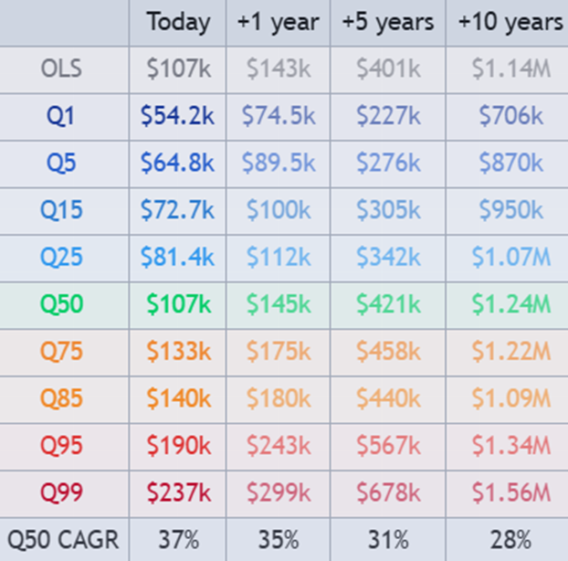
The model also shows the current Q50 CAGR, which is 37% p.a.; however, if Bitcoin reverts to its long-term mean from current levels, this will be much higher. The table shows that the Q50 trend is headed for $1.2m in 10 years, along with the quantile ranges that we can expect Bitcoin to trade within today and at 1, 5, and 10 years into the future.
Learn More About the Methodology
For readers interested in the statistical mechanics behind the model — including the mathematics of Jacobian weighting and Day-0 optimisation — we explain the full methodology here: Fixing the Early Data Bias in Bitcoin’s Power Law.
Check Out the Indicator
After many requests from the community, we’re excited to release the indicator.

👉 Add the mNAV Bitcoin Power Law Quantiles (time-corrected) indicator to TradingView
What do you think? We’d love to know how we can improve this. Drop a comment below.